I already talked about the way to customize CSS on wallabag v2.4+ instances in a previous post about tags.
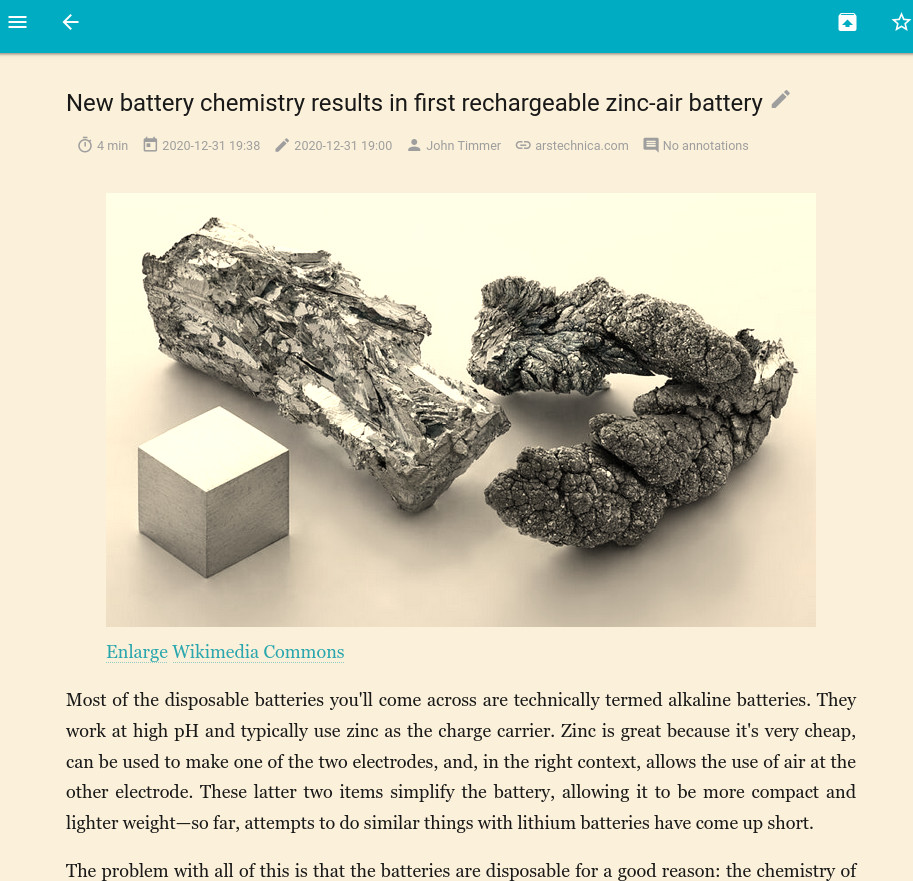
Today I'll show you how to use this feature to have a "sepia mode" for reading articles on your instance.
This color scheme lets you read content with a warmer tone than a classic light theme (like the default white background). It can be referred sometimes as a 'reading mode' (e.g. on Android devices).
So with the help of schemes we can find online, here is the result of a sepia color scheme for wallabag:

In order to have this, add the following content to web/custom.css:
#article {
  box-shadow: none;
  background: inherit;
}

.entry #main {
  background: #fbf0d9;
}

#article,
#article article {
  color: #191919;
}

#article pre,
#article img {
  filter: sepia(50%);
}

#article article a {
  filter: sepia(25%);
}
Two notes about this style:
- It removes the default box-shadow you have on entries
- It applies a browser-based sepia filter on images, code snippets and links
Further reading
Enjoy